BLOG DESCRIPTION
Website Design Trends In 2017
To stand out in a sea,
cling onto the latest web designing trends that will drag out more audience to
your page. The era of traditional websites has been ended, every companies
started to update themselves for the next generation with lot of ideas to sway the
crowd from competitors in savvy ways. Something that looks new yesterday has
gone out of trend these days. Now it is time for change, every small-scale company
has started migrating by re-designing their websites for a fresh appealing
look. To surpass your competitors hire a professional web designers who are
well-versed in UI/UX designing.
Elicit some catchy
methods that are trending currently over the internet.
Long
Scroll
In my percept, 2017
will be great year for the e-retailers. People are more aware about the online
business and now they are looking for elite endowment that impresses them with
new ideas. Like popular social media using long feeds for user convenience
instead of multiple navigation. Websites also started to evacuate with long scroll
options with breakdown of images, videos and text contents for vast knowledge.
Without navigating one can take glimpse over the service easily, it drags the
user attention particularly for some duration.
Videos/
GIF Animations
In this busy world, no
one have interest in reading more content, conveying your message through short
videos and GIF images will capture users vision. They will spend some more time
for watching if the quality of video is good and creative. Embed some short
realistic videos of your service to engage the customers.
Go
Artistic
Images are one of the
powerful tools for the market capture. Simply bulking out with multiple images
makes them annoyed. Make them to say wow by updating high quality images. Go
for a photo shoot and capture relevant pictures for your service description.
Even a single picture will speak lot it is really creative and with good
visuals.
Manage
your contents
Your words connect with
the user directly. Use catchy taglines and bold contents on the top of the page
to seize the users. Arranging the test in horizontal and vertical combinations
will also look appealing and enticing.
Adding straightforward
simple text dominates your market potential. People annoy indirect contents
that come with epitomes. Simple understandable texts create rapport with user
easily. Use minimalistic designs and posters, it portraits your creative level
to the public.
Well-Structure
Layouts
We people have the
habit of reading from left to right, using F-layouts with logo, taglines on the
top left make users easily know about you. Leave more white space in the page,
adding lot of contents and images will look weird. Make it short and crispy for
the user convenience.
Keep these points in
mind and also drag out some new ideas on your own intelligence to be on the top
of conversion rates.
Most Recent Articles
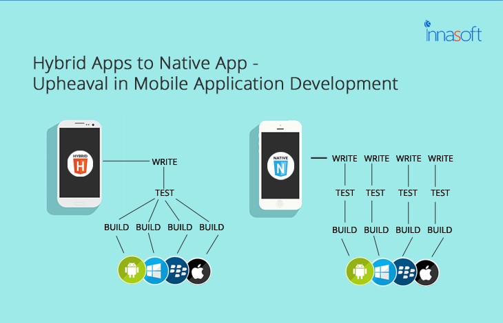
Hybrid Apps To Native App- Upheaval In Mobile Application Development
Aug 07, 2017
Mobile App Development

