BLOG DESCRIPTION

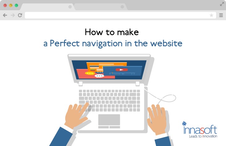
How To Make A Perfect Navigation In A Website
We can clearly say that Digital transformation has taken an immense blow by the people’s interest in the internet. We are just one click away for what we are searching for and this made people addicted to it in such a way that we prefer to search on the internet for any information whether it may be education related or fun or technology whatever they need, they look into the internet. Since we can find a number of websites which let us know the exact information what we are looking for and even more than that by simply sitting in our place at any time with the access of internet.
It's become really tough for the website owners to drag the users to their website to engage them with their brand. If you want to drive more traffic and engage users with your website then you need to look after your website structure, proper navigation and look & feel etc. Proper navigation is one of the most important factors every website owner should consider since poor navigation may affect user-friendly and thereby affects the whole website performance in search engines.
Here we are suggesting some tips that help to develop a website with proper navigation.
1. Clearly Visible:
It should be crystal clear for the users to click on so they can get the exact results. Don’t create confusion in users by poor navigation. Also, provide relevant and useful information with respect to the search query. Navigation must be clear, simple yet easily understandable. Users should easily go through the pages of the website and should easily find out what they are searching.
2.Uniform Designing:
Website should maintain uniform designs and navigation; in such a way that it should not impact negatively on user’s interest. If users navigate to any other page, it should consist right and genuine information to prevent the loss of interest. Unlike that, if a user finds irrelevant information then they may lose trust and thereby exit from the website. The landing page must create trust and confidence to the users that they have landed the exact match of the search query.
3. Keep it Simple:
Most likely website owners create more no. of options in the menu section which creates strain to users. Only place the high priority options in the header section which are most important and should give a clear overview of your website. Having selected number of items in the menu section gives a decent look to the website rather than misplacing and misleading the more number of items in a limited space. So to avoid this, designer can divide into the different groups. Arrange the items clearly from starting to the end of the website.
4. Structure of Website:
Website designing company or web designers should consider creating limited number levels in order make navigation simple for the users. A well-panned architecture can give you the better results so; prepare a plan while designing to avoid complications. Organize your site by separating pages into groups instead of nesting groups within groups.
Most Recent Articles
Hybrid Apps To Native App- Upheaval In Mobile Application Development
Aug 07, 2017
Mobile App Development


