BLOG DESCRIPTION
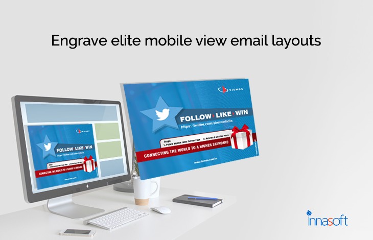
Engrave Elite Mobile View Email Layouts
Internet has been an
epitome for the huge deployment of business. With its support, people get
relatively more knowledge about the global brands. Digital marketing has
started been rising in the market with the growth of online business. To
promote one’s websites and mobile applications different marketing strategies
were followed. Email marketing has been
started in early days after the deployment of mail conversations. It even helped
out with good credits for the marketers to capture the consumer’s interest.
Same like social media marketing and other techniques, custom-tailored designs
are used for email to bring out catchy display of your brand.
You might also think
that most of the people are not interested in email ads; I would say your
assumption is wrong. Consumers are impressed much if your deals and products
are good and more engaging. For example: while going for retail shops we might
be listed out few products for purchase if the shop is more attractive with new
products then we return with huge basket of stuff. Leave your imaginary ideas
to design your email page that could possibly return you good credits. Most of
the users, accessing their emails via mobile phones, device compatibility is
much more dominating in these days. Your email should be responsive that can
fit on all screens so user can be convenient on understanding your deals much
more easily.
Haunt
for eye-catching designs
Scheming ideas to blend
your email ads with spectacular views with more information in single page is
worth for the business. Approach the website
design company to bring out some new concepts in the designing. First of
all, note some important things which should be considered in stellar email.
Use one column format
instead of multiple columns so that you can place your contents neatly. One
column will fit on all devices either it is a mobile view or web view. Avoid
multiple messages that may puzzle the readers. Use simple text to describe
about your service and current offers. Use varying text sizes for headlines and
inline messages to give different look making user quite easy for reading. Using
padding for the images and elements to bring the centre of attraction is will
make good design. Increase the margin spaces that will make your email design
simple and elegant.
Button links for
navigation and image blocks will be a pretty good concept. User can able to
navigate to your website by using the links for more knowledge about you. Image
blocking is also a savvy trick. Use short headlines especially for the mobile
view long texts won’t fit for the small screens. Inspiring the customer lays on
your side, you to think different for the new possibilities and news for email
advertisements.
Most Recent Articles
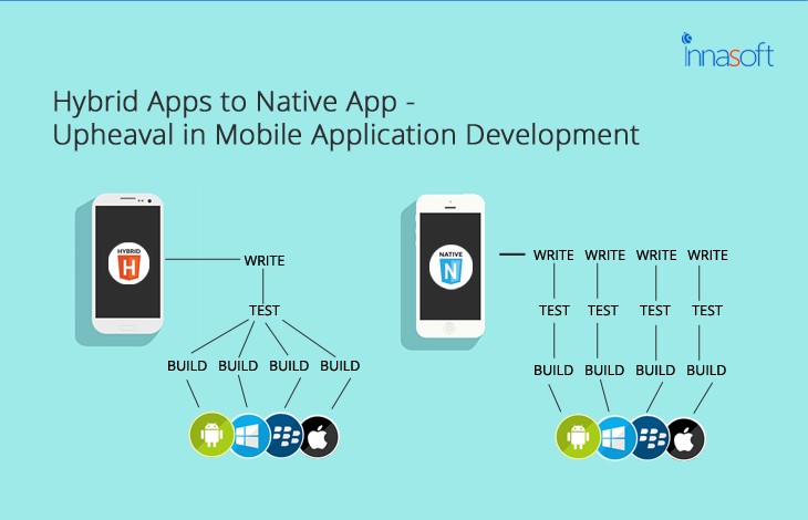
Hybrid Apps To Native App- Upheaval In Mobile Application Development
Aug 07, 2017
Mobile App Development

